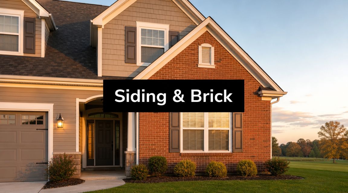
Choosing a siding color with red brick sounds simple until you put real samples against the wall and realize most advice skips the hard part. Red brick already brings strong color, texture, and undertones. If the siding fights it, the whole house can feel disjointed, even when each material looks good on its own.
That's why the best pairings aren't just about picking a pretty swatch. They're about value contrast, undertone control, roof coordination, and how the house reads in real Pennsylvania light from Sharon to Pittsburgh to Erie. A cloudy morning, leaf-heavy lot, or black roof can shift the whole exterior.
One practical rule shows up again and again in exterior guidance. Siding should usually be lighter than the red brick so the brick stays visually dominant, and widely recommended pairings include gray, beige, and navy, with warm beige and soft cream standing out as especially dependable choices for a timeless look, according to this red brick and black roof siding color guide.
If you want a broader sense of how a full exterior palette comes together, this Melbourne house painting colour palette guide is a useful companion read. Now to the combinations that work.
Table of Contents
- 1. Cream or Off-White Siding
- 2. Charcoal Gray or Slate Gray Siding
- 3. Warm Tan or Beige Siding
- 4. Dark Green or Forest Green Siding
- 5. Navy Blue or Dark Blue Siding
- 6. Soft White or Ivory Siding with Accent Trim
- 7. Warm Brown or Taupe Siding
- 8. Light Gray or Greige Siding
- 8-Option Siding Colors for Red Brick
- Making Your Final Decision with Confidence
1. Cream or Off-White Siding
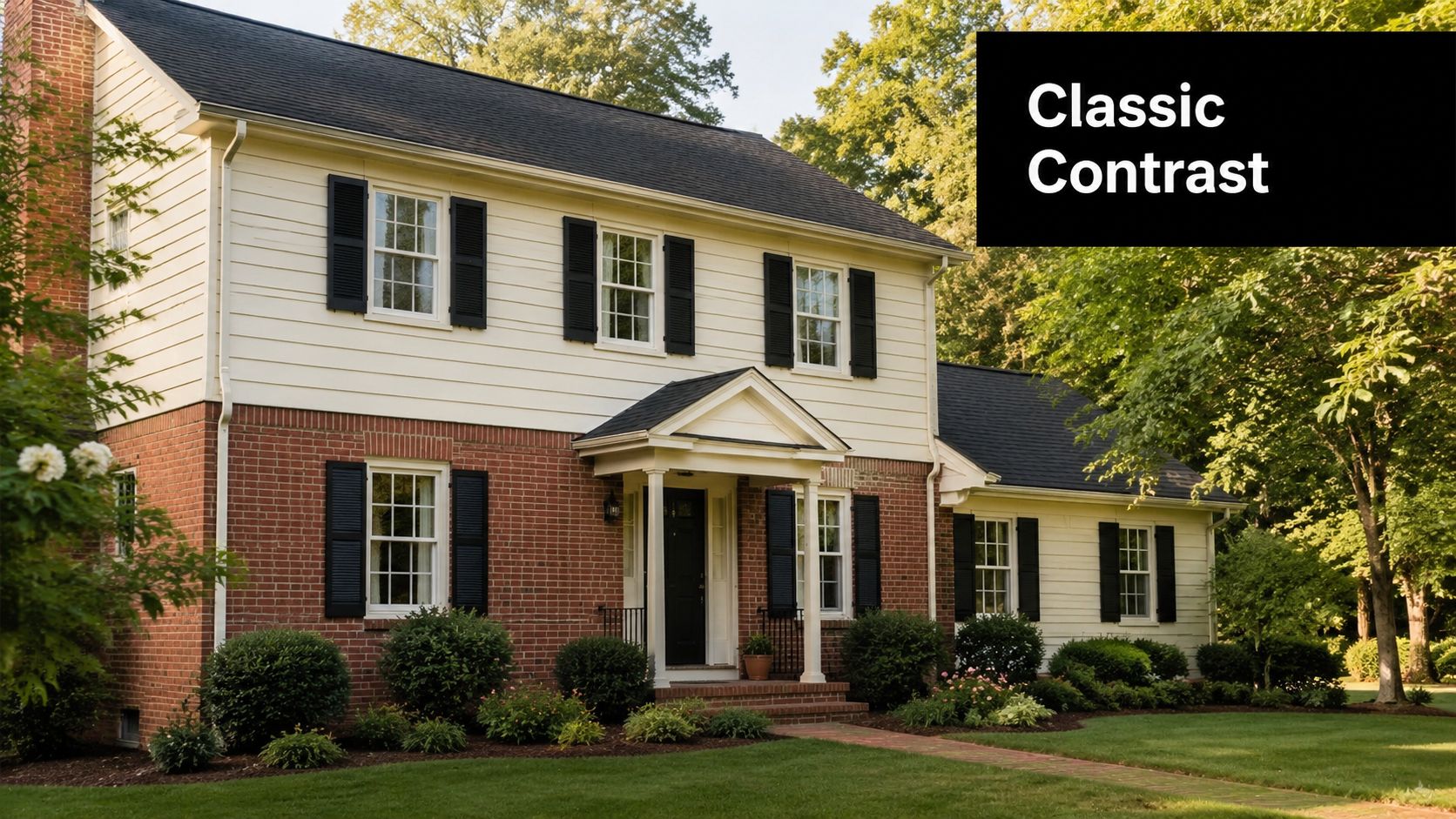
Cream is one of the safest and best-looking answers if you want a siding color with red brick that won't date the house. It softens the contrast without flattening the exterior, and it works especially well on Colonials, farmhouses, and traditional two-story homes common around Pittsburgh suburbs and older neighborhoods near Sharon.
The reason it works is simple. Red brick already carries warmth. A warm cream or off-white picks up that warmth instead of fighting it, while still staying light enough to let the brick remain the star.
Why it works on red brick
Soft cream looks better than stark white on most red brick homes because it respects the mortar and the clay tones in the brick. If the siding goes too bright, the brick can suddenly look dingy or overly orange by comparison.
Practical rule: If your brick has a rusty, orange-red cast, skip icy whites and move toward cream, ivory, or soft vanilla.
This pairing is easy to finish well. Black shutters, charcoal gutters, and a painted front door in a deep accent color can sharpen the look without making the house feel harsh. In Mercer County and other older Pennsylvania neighborhoods, that balance matters because many homes already have strong architectural details that don't need an aggressive color palette.
A few details make or break this combination:
- Choose warmth on purpose: Look for cream with yellow-beige undertones, not pink undertones.
- Use trim for structure: Dark shutters or a darker front door keep the exterior from looking washed out.
- Check the mortar too: Cream that relates to the mortar usually reads more intentional than cream picked in isolation.
If you're changing the cladding layout, not just the color, this guide on putting siding over brick is worth reviewing before finalizing the design.
2. Charcoal Gray or Slate Gray Siding
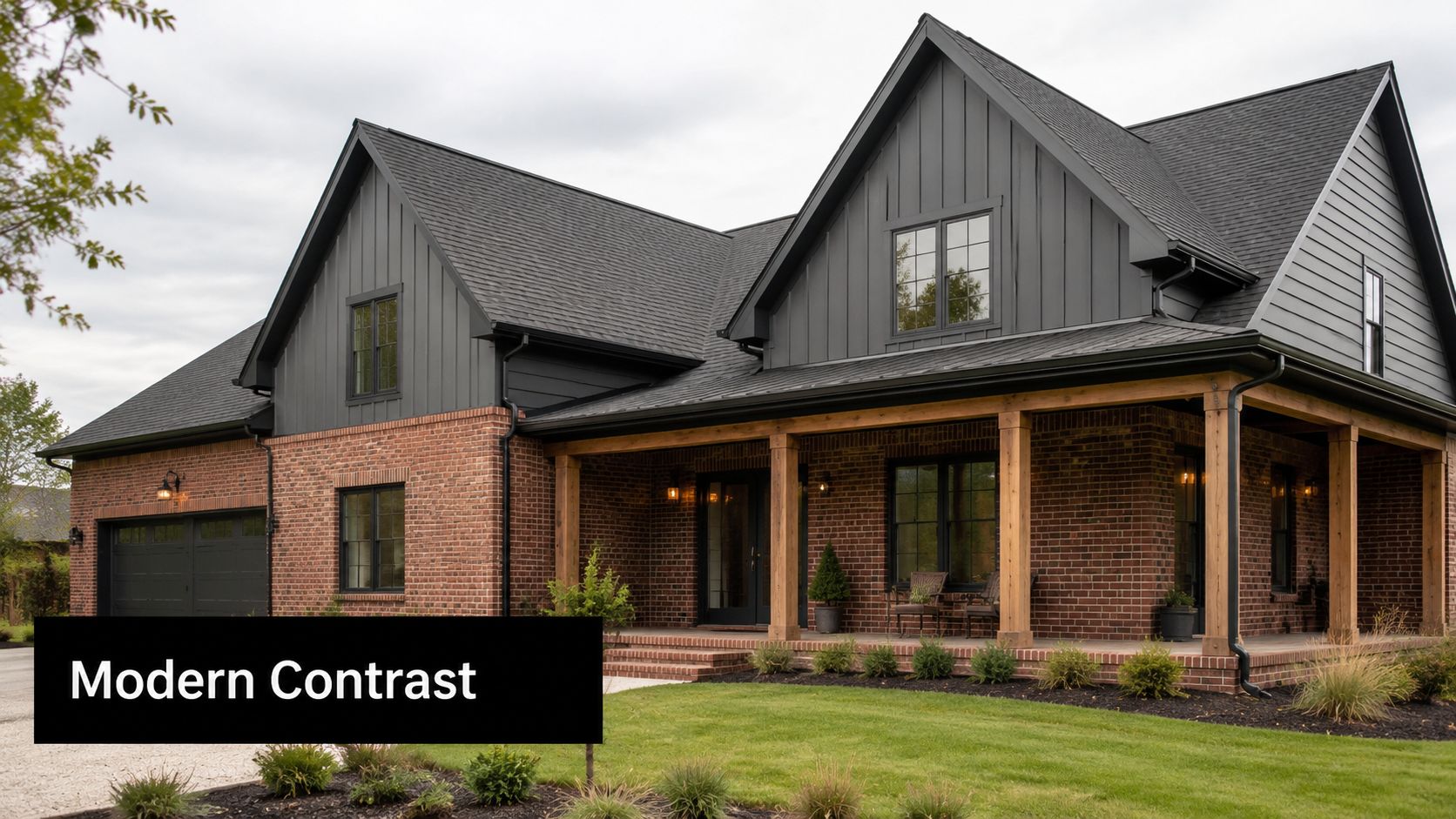
Charcoal gray changes the mood fast. It pushes a red brick home toward a more refined, contemporary look, especially on mixed-material facades with vertical panels, board-and-batten, or clean-lined trim. I'd use it when the house already has some modern intent, not when it relies on soft historic charm.
This is one of those colors that looks expensive when the undertones are right and awkward when they're not. Cool slate can flatter a cooler red brick. Very dark gray on warm orange-red brick can feel abrupt unless trim and roof details help bridge the gap.
Where gray succeeds and where it misses
On newer exteriors, gray often works because material selection has become more standardized and easier to coordinate. One exterior design source notes a broad palette of named options for red brick pairings, including gray and muted blue families, and highlights options such as Pearl Gray, Gray Slate, Aged Pewter, Night Gray, and Iron Gray in curated collections, as shown in this brick combination guide from Renoworks.
That matters in practice. Homeowners in Erie or Beaver County can now compare several controlled gray options rather than trying to guess from a tiny paint chip and hoping the installer can match it later.
Dark gray siding needs relief. If the roof is black and the window frames are black, add cream trim, lighter soffits, or a wood-toned door so the house doesn't read as one heavy mass.
A few real trade-offs come with charcoal:
- Best use case: Contemporary farmhouse, updated split-level, or mixed brick-and-panel elevation.
- Biggest risk: Going so dark that the brick loses importance.
- Trim advice: Warm white or cream trim usually outperforms pure white here.
If budget is part of the decision, compare color direction and material choice together, not separately. This overview of the average cost of new siding can help frame the conversation before you commit to a premium-looking dark finish.
3. Warm Tan or Beige Siding
Warm tan or beige is what I recommend when homeowners want harmony first and contrast second. It doesn't try to steal attention from the brick. Instead, it makes the whole elevation feel settled and cohesive, which is often the right call on ranch homes, traditional suburban houses, and properties with warm landscaping or stone accents.
This combination tends to look especially natural in western Pennsylvania because the palette fits the region. Clay soil, mature trees, weathered stone walks, and softer seasonal light all support warm neutrals better than sharp, high-contrast exteriors on many homes.
Best fit for warmer brick
Beige works best when the brick leans warm. Think orange-red, terracotta, or brown-red. If you choose a tan that's slightly lighter than the brick, you preserve separation without making the house look striped or overly busy.
This is also one of the most defensible choices for resale-minded owners. In the U.S. new single-family market, brick appears on 18.5% of homes, while vinyl siding and fiber cement account for 25.6% and 21.7%, which reinforces how often buyers see mixed-material exteriors rather than all-brick facades, according to this brick vs. siding market and design overview.
That mixed-material reality is why beige keeps showing up. It gives contrast without forcing a bold stylistic statement.
- For tan brick partners: Golden beige, sand, biscuit, and muted khaki usually blend better than pink-beige.
- For trim: Try deeper brown, muted green, or soft off-white instead of bright white.
- For roofs: Black works, but medium brown and weathered charcoal often feel more integrated.
If your home is in Mercer County and you're trying to tie siding, trim, and installation together, a local siding contractor in Mercer, PA can help assess what reads best on your specific brick in natural light.
4. Dark Green or Forest Green Siding
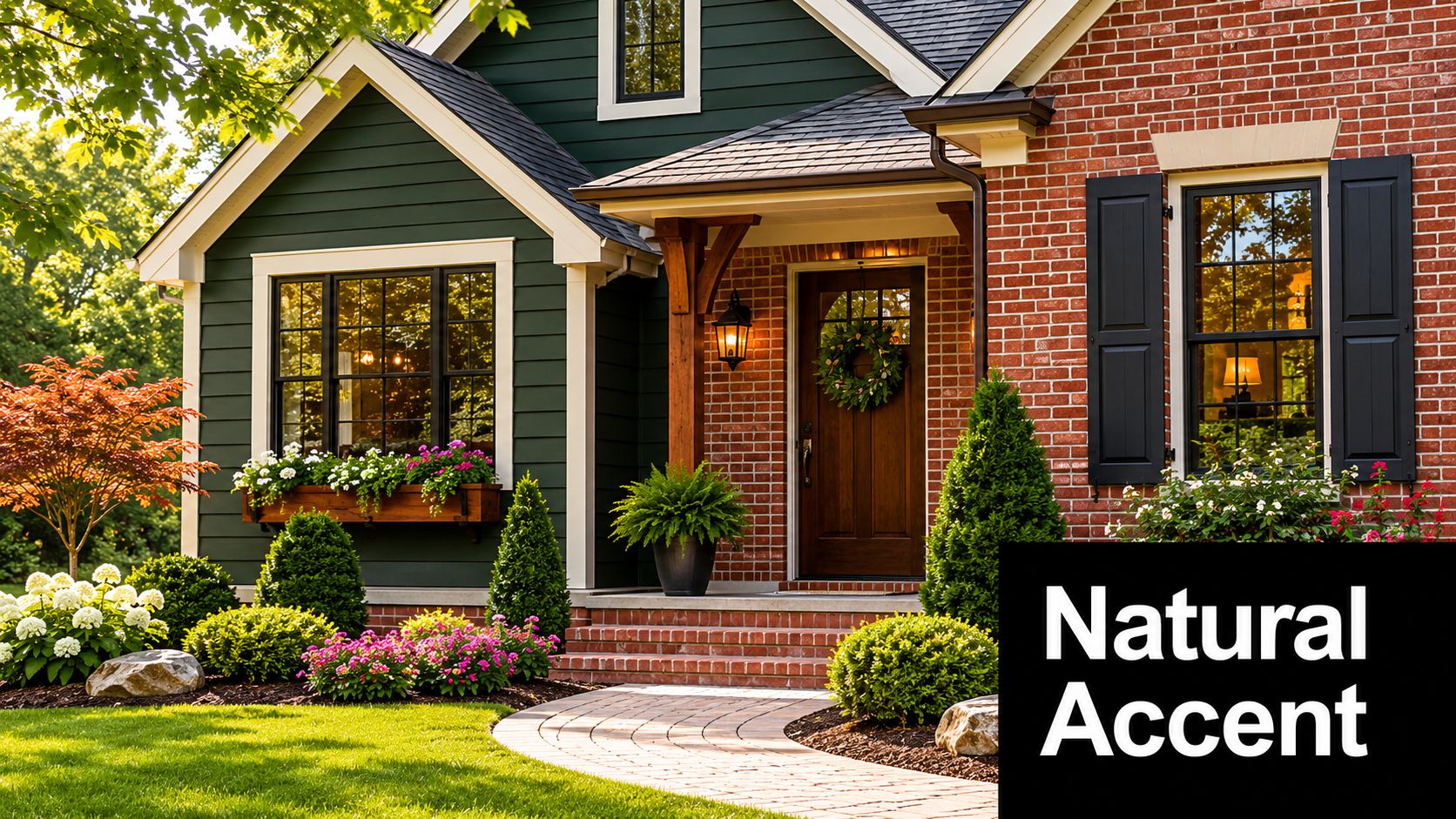
Dark green isn't the default recommendation, but it can be one of the most character-rich options. It works because red and green are natural complements, yet on an exterior the relationship needs restraint. Forest, hunter, and blackened green can look grounded and classic. Bright or yellow-green shades usually look restless against brick.
I like this combination on Colonials, farmhouse-inspired homes, and houses set into tree-heavy lots around Sharon or rural parts of western Pennsylvania. The setting helps the color make sense.
How to keep green from feeling too heavy
Green needs support from lighter surrounding elements. White or cream trim around windows and fascia can keep the color from collapsing into the roofline, especially when the roof is already dark.
A strong approach is to use dark green on upper gables, dormers, or selected siding fields rather than covering every wall surface. That gives you personality without overloading the elevation. On homes with a lot of brick on the lower level, this approach often feels balanced.
Brick with warm clay notes usually likes green with earthy depth, not cool emerald sharpness.
Where homeowners get into trouble is choosing a green that looks elegant on a paint card but reads almost black outdoors. Pennsylvania cloud cover can mute color fast. If you're interested in forest green, test it on the shadier side of the house, not just the sunniest wall.
Good pairings include cream trim, bronze light fixtures, and a stained wood or deep painted front door. If you want something less expected than beige but not as visually demanding as navy, dark green often lands in the sweet spot.
5. Navy Blue or Dark Blue Siding
Navy blue can look outstanding with red brick, but this is not a no-fail option. It's a deliberate design move. Done right, it gives the house crisp contrast and a slightly sophisticated, well-defined feel. Done poorly, it can make the brick look louder and the exterior more pieced together than polished.
The key is choosing the right navy. You want a true navy or a softened dark blue, not something purple-leaning or overly electric. On homes in Pittsburgh or Erie with black roofs, navy can either create an elegant frame or make the upper portion of the house feel too dark.
Use navy carefully
This color family has become more visible in red brick guidance. Design recommendations now include blue-toned and earth-toned options alongside classic neutrals, and some curated product palettes specifically list dark blue choices such as Boothbay Blue and Evening Blue for use with red brick and black roofs, as noted earlier in the Renoworks guidance.
That doesn't mean every blue works. Some design advice explicitly notes that deep blues can clash in certain situations. That warning is accurate in the field. If the brick has strong orange undertones, a hard, cold navy can feel disconnected.
Use navy when the house has clean trim lines, balanced window placement, and enough light trim to separate materials. It often works better on homes with partial brick facades than on elevations where brick dominates almost every visible wall.
- Best trim pairing: Cream, soft white, or pale gray.
- Best door direction: Natural wood, black, or a restrained red that relates to the brick.
- Common mistake: Pairing navy siding with bright white trim and red brick that already has high contrast.
Navy is a confident choice. Just make sure the architecture can carry it.
6. Soft White or Ivory Siding with Accent Trim
Soft white or ivory is different from plain white siding. The base color stays warm and quiet, while the trim and accents do more of the design work. If you want a clean exterior without making the house feel stark, this is one of the smartest ways to handle a siding color with red brick.
It works especially well on homes where shutters, fascia, window casing, porch columns, or gable details deserve more attention. Instead of relying on the siding alone, you build the palette in layers.
Trim does the heavy lifting here
The siding should stay creamy enough to sit comfortably beside the brick. Then you can bring in accent trim in charcoal, dark green, or navy depending on the mood of the house. Colonial homes usually like dark shutters. Farmhouse updates often look better with darker fascia, simpler trim lines, and a cleaner front door color.
This route is also forgiving. If the brick has mixed tones, soft white or ivory can bridge them more easily than a more opinionated body color. That matters on older homes where the brick may have variation from weathering, repairs, or age.
A strong exterior plan might look like this:
- Siding: Warm ivory or soft off-white
- Trim: Charcoal or dark green for definition
- Front door: Wood stain, black, or muted navy
- Roof coordination: Black roof works well, but keep the white warm so the top half doesn't feel too sharp
Use accent trim where the architecture already gives you natural breaks. Window casings, shutters, porch posts, and gables are enough. You don't need to outline every edge of the house.
For many Pennsylvania homes, this approach gives the exterior freshness without pushing it into a trendy look that may age badly.
7. Warm Brown or Taupe Siding
Warm brown and taupe are underrated with red brick. People often dismiss them because they assume the result will be too brown overall. That can happen, but only when the values are too close and the undertones are muddy. When selected well, taupe creates one of the most custom-looking palettes in the group.
This pairing makes a lot of sense on homes with stone foundations, wood porch details, or mixed masonry. It reads grounded and architectural rather than high-contrast.
When taupe feels custom instead of muddy
The trick is separation. A warm taupe should relate to the brick, but not mimic it. If the siding and brick sit in the same depth range, the house can lose shape. If the taupe is lighter and slightly more muted, it complements the brick while still giving the eye a clear distinction between materials.
I've found this works best on warmer brick and houses with substantial mass. A broad ranch, a deep front porch, or a home with multiple roof planes can carry taupe well because the color has enough architecture to support it. On a smaller house with little trim, the same color can feel heavy.
Use lighter trim to keep the palette open. Cream, soft khaki, or a restrained off-white usually works better than stark white. Metal accents in bronze or matte black can also sharpen the look without introducing a new color family that competes.
This is a good option for homeowners who don't want a safe beige but also don't want a bold blue or green. It sits in the middle. Refined, warm, and usually more forgiving than people expect once the samples go up.
8. Light Gray or Greige Siding
Light gray or greige is often the best compromise between traditional and current. If you want the house to feel updated but not aggressively modern, I'd suggest beginning with light gray or greige. Greige is especially useful when the brick has a mix of red, brown, and slightly muted tones that make pure gray feel too cold and pure beige feel too yellow.
The strongest versions of this palette lean warm. They don't try to erase the brick's warmth. They absorb it.
A safer modern neutral
Another design source reinforces that gray, beige, and white remain the most popular choices with red brick, which tells you something important. Even as color options have expanded, neutral palettes still dominate because they're easier to coordinate and less likely to clash with the undertones in the masonry, as noted in the earlier design guidance on red brick pairings.
That's exactly why greige has become such a practical choice in places like Erie and Pittsburgh, where daylight can shift cooler and homes often sit among mature landscaping, asphalt drives, dark roofs, and varied masonry. Greige can bridge all of those elements.
A few rules help:
- Choose warmth: If the sample flashes blue or silver, it's probably too cool.
- Mind the roof: Black roofs make cool gray look cooler. Weathered charcoal is often easier to pair.
- Use trim intentionally: Black trim pushes the look modern. Cream trim keeps it softer and more traditional.
This color family also works well on split-levels and updated suburban homes that need visual cleanup. It simplifies the palette without making the exterior feel bland.
8-Option Siding Colors for Red Brick
| Option | Implementation Complexity 🔄 | Resources & Maintenance ⚡ | Expected Outcome ⭐📊 | Ideal Use Cases 📊 | Key Advantages 💡 |
|---|---|---|---|---|---|
| Cream or Off-White Siding | Low 🔄, straightforward selection/installation | Moderate ⚡, easier upkeep than dark colors but shows stains | Timeless, bright curb appeal ⭐, highlights brick without competing 📊 | Colonial, farmhouse, historic restorations 📊 | Neutral backdrop; broad compatibility; brightens facade 💡 |
| Charcoal Gray or Slate Gray Siding | Medium 🔄🔄, careful shade and trim coordination | Moderate ⚡, hides soiling but needs algae prevention | Sophisticated, modern contrast ⭐⭐, high-end visual impact 📊 | Modern farmhouse, contemporary mixed-material homes 📊 | Designer look; conceals dirt; dramatic contrast with brick 💡 |
| Warm Tan or Beige Siding | Low 🔄, simple selection for warm palettes | Low-Moderate ⚡, minimal upkeep if shade selected well | Harmonious, cohesive appearance ⭐, warm, understated unity 📊 | Mediterranean, Spanish Colonial, warm transitional homes 📊 | Creates unified, inviting exterior; complements warm bricks 💡 |
| Dark Green or Forest Green Siding | Medium 🔄🔄, requires shade testing and trim balance | Moderate ⚡, darker finish upkeep; ventilation considerations | Traditional, natural accent ⭐, elegant, grounded look 📊 | Colonial, farmhouse, traditional and landscape-focused sites 📊 | Earthy, timeless; blends with landscaping; classic appeal 💡 |
| Navy Blue or Dark Blue Siding | Medium-High 🔄🔄🔄, precise coordination and sample testing | Moderate-High ⚡, heat absorption and maintenance concerns | Distinctive, upscale curb appeal ⭐⭐⭐, memorable and refined 📊 | New England-inspired, high-end renovations, statement homes 📊 | Bold yet elegant; strong visual identity; historically grounded 💡 |
| Soft White or Ivory with Accent Trim | Low-Medium 🔄🔄, trim color choice drives outcome | Moderate ⚡, keeps bright look with regular maintenance | Clean, flexible aesthetic ⭐⭐⭐, bright base with accent options 📊 | Contemporary farmhouse, colonial, cottage styles 📊 | Bright, versatile backdrop; easy to update via trim color changes 💡 |
| Warm Brown or Taupe Siding | Medium 🔄🔄, careful shade matching to avoid muddiness | Moderate ⚡, may require special ordering and sample checks | Earthy, sophisticated blend ⭐⭐, cohesive with mixed materials 📊 | Homes with stone/brick mixes, Mediterranean and luxury builds 📊 | Harmonizes with natural elements; masks weathering; upscale feel 💡 |
| Light Gray or Greige Siding | Medium 🔄🔄, precise greige selection critical | Moderate ⚡, trend-forward; requires correct undertone selection | Contemporary, balanced neutrality ⭐⭐⭐, modern and versatile 📊 | Modern farmhouse, contemporary renovations, new construction 📊 | Bridges warm and cool tones; flexible trim pairings; designer appeal 💡 |
Making Your Final Decision with Confidence
The best siding color with red brick depends less on trend and more on relationship. You're building a palette around a permanent material that already has color authority, surface texture, and visible undertones. If you respect those qualities, the house will look composed. If you ignore them, even expensive materials can feel mismatched.
Start with the brick itself. Look at it on a dry, bright day and on an overcast day. Red brick may lean orange-red, brown-red, or deeper crimson, and that undertone should guide every choice that follows. One of the most practical rules designers use is to check the brick undertone first, then relate the siding either to the mortar or to a lighter value than the brick so the facade stays balanced, as described in the earlier market and design overview.
That lighter-than-brick rule saves a lot of projects. It keeps the house from feeling top-heavy and helps the brick remain the dominant material instead of getting visually buried by a body color that's too dark or too saturated.
Then step back and evaluate the whole exterior as one composition:
- Roofing: Black roofs sharpen contrast. Brown or weathered charcoal roofs soften it.
- Trim: Cream and soft white keep things classic. Dark trim adds definition but raises the visual intensity.
- Front door and shutters: These should support the siding, not compete with the brick.
- Landscaping and setting: Trees, shade, and stone hardscape can make colors read cooler or heavier than expected.
Large samples matter. Put them next to the brick, not on a detached board across the yard. Check morning light, afternoon light, and a cloudy day. In Pennsylvania, a color that looked balanced at noon can look much cooler by evening, especially on north-facing walls.
If broad appeal is the priority, neutrals remain the strongest route. Cream, warm beige, soft gray, and greige usually give you the best balance of harmony and flexibility. If you want more personality, dark green and navy can work well, but only when the brick undertone, trim, and roof all support the move.
Exterior updates rarely stop at color. They touch installation details, trim profiles, moisture management, and the transition between masonry and siding. If you want help translating swatches into a complete plan in Hermitage, Erie, or the surrounding counties, Penn Ohio Roofing & Siding Group is one local option homeowners can contact for siding-related guidance and installation. And if you're also thinking about the bigger picture outside, this article on how to improve your home's curb appeal can help connect your siding decision to the rest of the property.
If you're ready to compare real siding samples against your red brick and talk through installation options, Penn Ohio Roofing & Siding Group can help you evaluate color direction, material fit, and exterior coordination for homes across Hermitage and nearby Pennsylvania communities.